Transamerica Mobile App
While consulting for Transamerica, one of the projects I focused on was restructuring and redesigning the user interface for their retirement management mobile app.
ClientTransamericaServicesUser Experience optimization, Visual DesignMy RoleUX | UI ConsultantLength3 months
Problem to solve
Streamline the user experience, remove the clutter both in functionality and visual design. Apply a new design system and update the visual design with a strict adherence to Transamerica’s new brand guidelines.
My Process
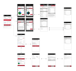
I preformed a user experience evaluation. During this evaluation I analyzed the layout of information both logically and visually. After the assessment I created an App Map to see the flow of all pages and sub pages. Based on click thru data and information provided by stake holders determined the high traffic area and prioritized information and specific tasks. In the end this resulted in a much simpler experience resulting in half of the back and forth for common task, related information was much easier to access and preform informed decisions for managing retirement fund dispersion.
User flows
Prototyping
Wireframing
Visual Design
Updated Information Architecture
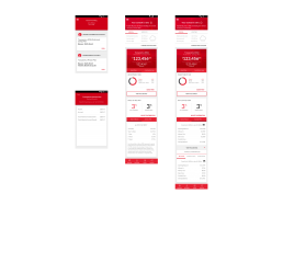
The newly recommended experience brings the information to the users fingertips in a much more concise way, limiting the feeling of navigating a dense confusing app. The two images below contain access to the the same information with half of the back and forth and screen transitioning. This reduces frustration and cognitive overload placed upon the user from having to search for the information they are looking for resulting in straight forward and enjoyable experience.
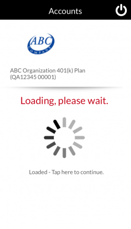
Before
After
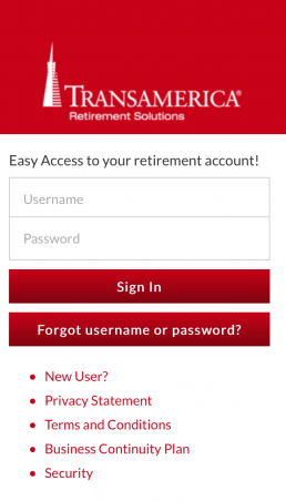
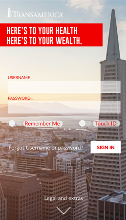
Visual Comparison
Below are two examples or the original app and the redesigned screen for visual comparison.
Before
After
Before
After